Joaquim Marquès Nielsen har i sin egenskab af grafisk designer, konceptudvikler og animator løst flere opgaver for Danmarks Radio. Han har i alle henseender været en udtalt fornøjelse at arbejde sammen med, og det er slående hvor ekvilibristisk, disciplineret og selvstændigt han går til sagen – ikke mindst fordi han ikke engang havde afsluttet sin uddannelse da vi hyrede ham. Blandt andet har han designet og eksekveret en såkaldt “spip”, en kort animation, der blev brugt som et effektfuldt punktum for vores programmer til de unge seere.
Jeg giver hermed Joaquim Marquès Nielsen mine varmeste anbefalinger. Hvis ovenstående ønskes uddybet står jeg naturligvis til rådighed. - Mads Brügger, Danmarks Radio
I like working with Mr. Marquès Nielsen because of the certainty of uncertainty. You give him a task and you receive a result you didn't expect because of his own ambitions. You can be sure that he will raise the bar - and do it with a smile. I recommend him to people who are looking for graphic design and moving images with artistic aspirations delivered on time and on budget. - Carsten Borch (Idékaptajnen).
Jokke, as I have learned to call him, is very good at listening to what you want him to do. He asks a lot questions to make sure he knows exactly how you want the finished work to be like - and then he takes it to the next level. Sometimes the results are exactly as you wanted, and other times he's made something you'd never expect - but in a good way. I can highly recommend Jokke and his work, basically because you get more than what you pay for. - Chris Bjerremose (aka Bazh).
Joaquim has always been incredibly talented and creative. I remember when we were in high school, he would spend all of the breaks in front of the computers working on his video “Hjælp Mig Pia”. The result was amazing. I have never laughed as much as I did when I first saw the video. - Mathias Søndergaard.
I met him on the Internet portal blogtv.com. I haven't known him for long, but first of all he's funny, secondly he's creative and thirdly he's a joker. I think I found a good contact person in Denmark. It is nice to know that he exists. God bless you Joaquim. - Evrim Kutay.

 Tillykke Line



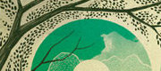

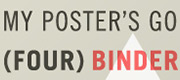
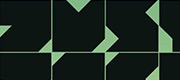
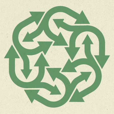
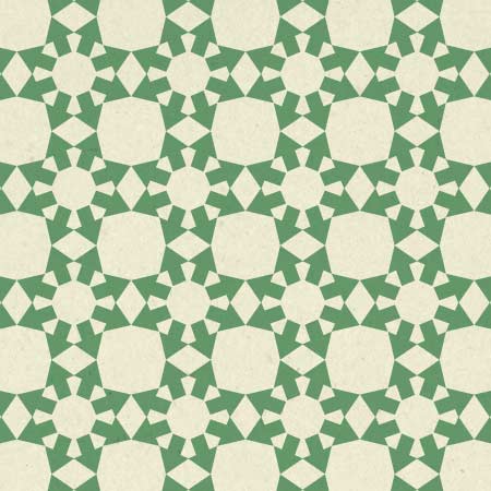
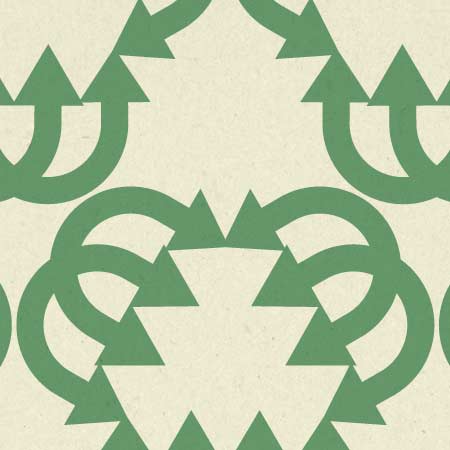
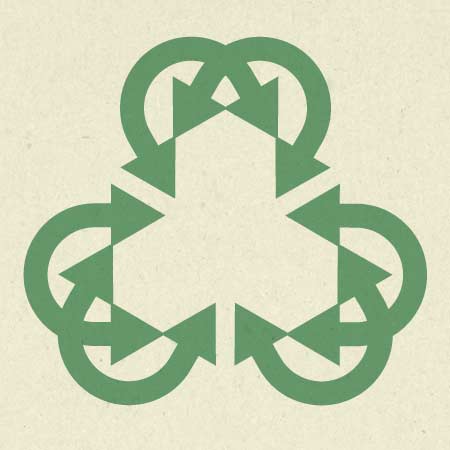
great stuff!, i like the second one. i like stuff that is build out of one sort of shape but totally doesn’t look like the shape at first sight
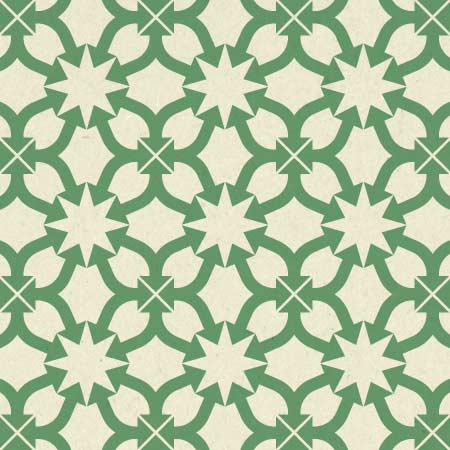
cool cool!!…i love the third one, reminds me a bit of a poster shown in the film about helvetica….
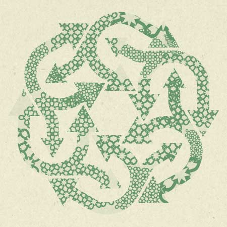
Melvin -> I’m glad you notice this. That’s exactly what I tried to achieve with the patterns.
Mathias -> Thanks! And that’s a great movie. Gotta get my hands on that someday :)
@Jokke-svin
You have to! - I´ve seen it like 20 times, and still finding it inspiring
By the way - where are you working?…
Mathias -> Right now I’m just doing some random freelance stuff. Wow I just saw that FontStruct on your blog btw. That’s awesome for creating identities and not having to mess around with the more hardcore editors such as FontLab. Nice!
Okay cool, so you will be updating your folio soonish??…heh
yeah, it´s quite old news…but i just could not life without, having it on my blog…:)..looking forworrd to use it for new sweet identiities…
And it has also inspired me for the next blog post, which will be about Typography in Copenhagen…my plan is to go out today, and shoot lots of photos…ONLY OF TYPO!…
Oh yeah that’s right, I haven’t really paid much attention to my portfolio for quite some time now. For that I’m sorry, hehe. Gotta go through my new projects and throw up the good shit… dedicate a day for that I guess.
It’s so much fun to run around snapping typo off the streets. I did the exact same thing here in Kolding in connection with a project at the Design School. At the end of the day, I had quite the neat collection of random typo from Kolding. It now sits on a CD. I remember taking a lot of pics down at the harbor. That’s generally a place with lots of great typo in my opinion. Go the the harbor or any other industrial zone if you get the change. It’s got killer typography / symbols / pictograms.
Happy hunting.
yeah you are right!…
I also find industrial places quite cool..there are so many diffrent things which relates to design, but in a very diffrent way then everything else….
I mean, if you think about a contanier….which clearly just is pure metal…and then you put some clean typo on. e.g. Helvetica….
Okay, sound cool??…
Found it like a month ago - very cool website, just showing some cool offices…and i am so in love with this office, who has a container with clean typo on…
Check it out!!!
http://wherewedowhatwedo.com/spaces/189-burnkit
btw…thier own website is also pretty sweet!!
http://www.burnkit.com/
http://www.flickr.com/photos/normark/2661133406/sizes/l/
and my own little office…getting more wallstickers soonish…:)
Some typo and apple logo..i find it quite fun to decorate things,…
Pingback: JOKKE-SVIN.DK - Joaquim Marquès Nielsen » Bubble experiments